Data-Driven Design
Ten Adams led with a Digital Audit, where we used a series of heatmaps, analytics and other usability testing methodologies to develop a clear picture of how Trinity’s audience engaged their website. This revealed several challenges with the current design including multiple clicks to find a doctor, an overcrowded services menu, poor site search and multiple navigation menus for mobile, all of which created an inefficient and undesirable user experience.
only 1% of all pages accounted for over 40% of all traffic
In order to shift website performance, we defined priority goals:
- Simplify navigation and site architecture
- Revise and optimize content strategy for search
- Deliver a mobile first user experience
User Feedback
In addition to analytics, we encouraged users to participate in a survey to validate opportunities and needs. The feedback provided powerful insight and very specific considerations that needed to be included in the project.
“I want the ease of searching for a doctor...and their phone number...quickly.”
– Survey Participant
Business Strategy
After the audit we traveled to Minot, North Dakota to share the findings and conduct an onsite Digital Discovery Session with key stakeholders of the Trinity Health leadership team. Together, we identified the key business goals, audience segments, user acquisition journeys, behavioral actions, and critical outcomes that signify value delivered to Trinity’s bottom-line success. This collaborative approach helped reinforce the commitment of this initiative, and fosters accountability to measure the Key Performance Indicators (KPIs) that matter post-launch.
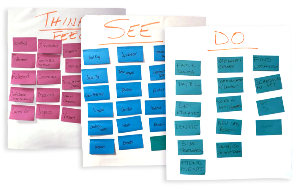
Empathy Mapping
A collaborative exercise that put leadership in the shoes of our target audience, to identify what they see, what they think or feel, and what they do when engaging with the website.
Crafting a Better Experience
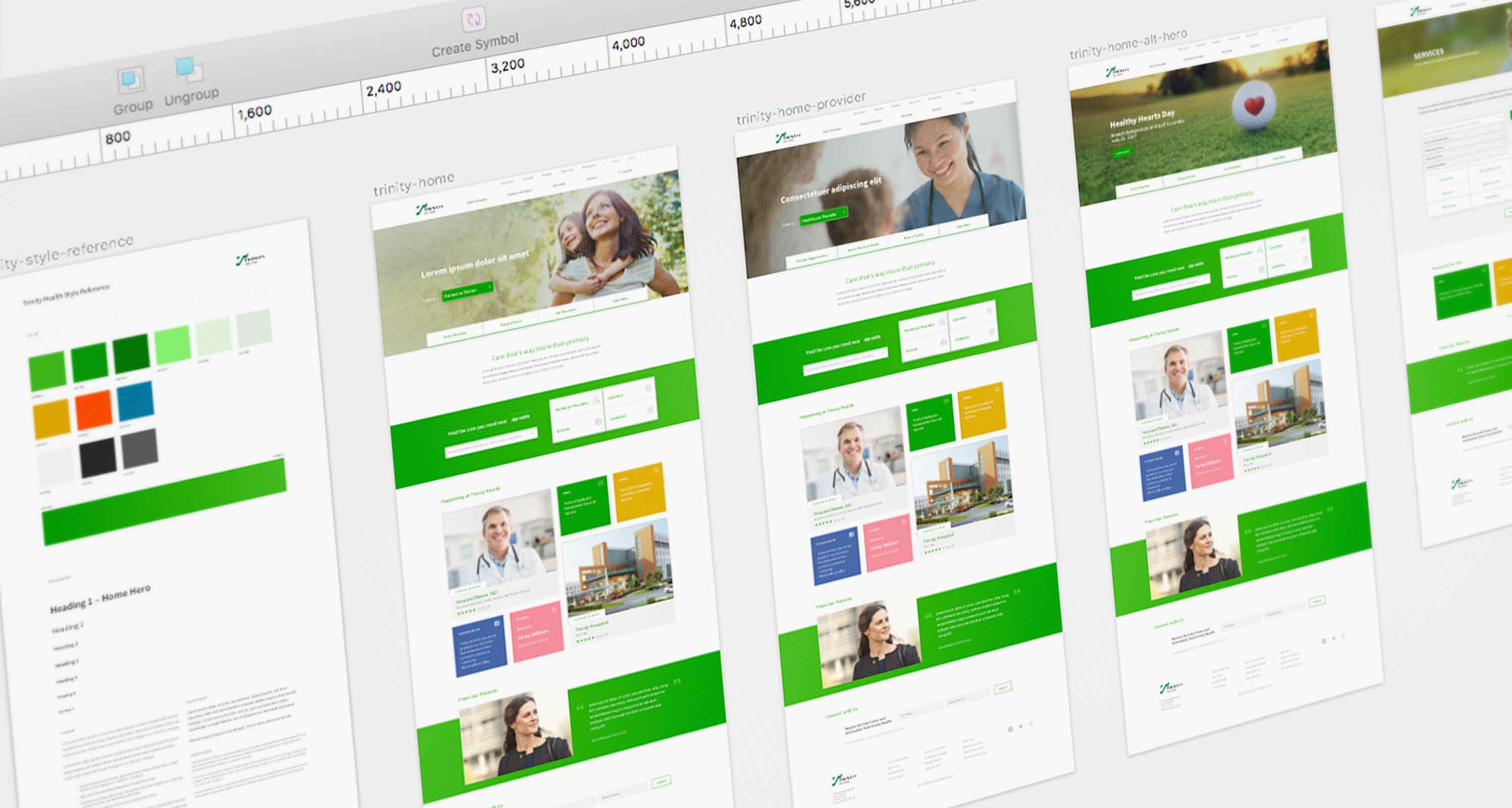
Once the strategy was solidified, we developed a series of sitemaps and wireframes to restructure and organize user navigation and integrate dynamic content. A point of emphasis that we constantly revisit is to “guide the user” in a way that is delightful. This supported the decision to use large tiles of content to define our audience, offer predictive access to priority needs (providers, locations, services and conditions), share the real-time activity happening in and around the network, and prove value with patient stories and testimonials.
Wireframe Design
We focused on the basics. “Give the user what they want, when they want it.” This approach streamlined the design structure, and supported a content strategy that anticipated user requests.

PRODUCTION DESIGN
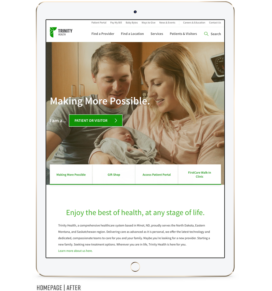
Trinity Health Website (Before and After)


Predictive Search
With a large footprint across North Dakota, it was important to communicate proximity and relevancy. We simplified the search process by incorporating simple user behaviors and best practices…just type or dictate.